
When an Organization Outgrows Its Own Website
A nonprofit almost never outgrows its website all at once. There's no morning where the site stops working. It just gets quieter — a little less useful every quarter, while the organization around it keeps getting bigger.
Then someone finally says it out loud in a staff meeting. Usually not the director. Usually whoever has been fielding the emails from people who couldn't find what they were looking for.
The site didn't break. The organization changed and the site didn't. Those are different problems, and they call for different conversations.
The startup site does its job, and then it doesn't
When an organization is starting out, the website has one real assignment: explain who you are and why you exist. That's it. A few pages, a clear mission statement, a way to get in touch. Anything more would be premature, and building more would be a waste of money you don't have yet.
That site is honest about where you are. It works because it matches the size of the thing it's describing.
What changes is that the organization grows past its own description. The catalog of programs gets longer. The community gets bigger. People start arriving at the site already knowing who you are, wanting to do something specific — register, give, sign up, find a date. And the site is still patiently explaining who you are.
The mismatch isn't cosmetic. A site built to introduce you will quietly undersell you once you're established. Visitors read it as a signal about your scale, because that's what a website is for most people — the only evidence they have.
What this looked like with Verso Ministries
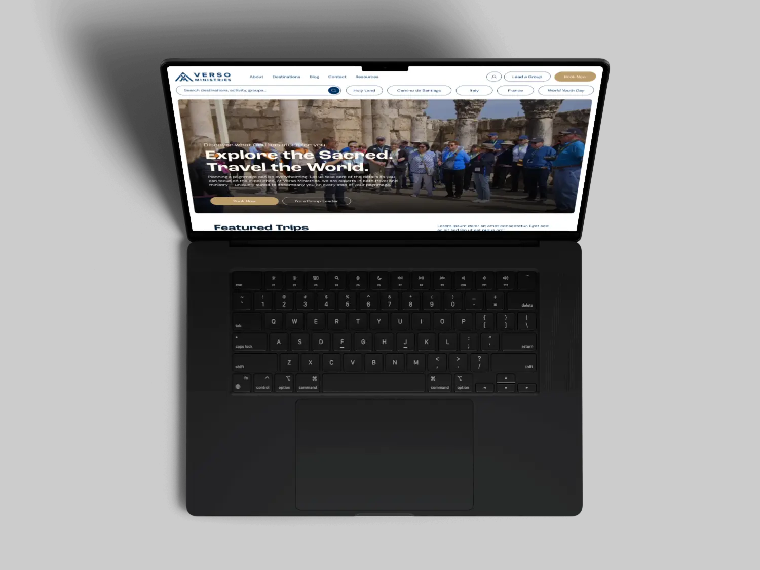
Verso Ministries guides Catholic pilgrimages — trips to sacred sites around the world, led with chaplains and daily Mass. They're a mission-driven company rather than a nonprofit, which turns out not to matter much for the pattern we're describing. We first worked with them when they were getting started, and they came back to us a few years later as a considerably more established organization.
That gap is the interesting part. We had built the earlier site, so we knew exactly what it was designed to do and exactly where it had stopped keeping up.
The original site could tell you what Verso was. It could not easily tell you which pilgrimages were running, where they went, or how to get on one. Someone could read the whole site, come away genuinely interested, and still have no obvious next step. For an organization whose growth depends on people committing to a trip, that's a real cost — and it's invisible, because nobody files a complaint about a path they couldn't find.
So the redesign started with an audit rather than a design file. Every decision got filtered through one question: does this help someone find a trip and sign up for it? Then we mapped the actual routes people take through the site — because visitors don't all arrive at the homepage, and a conversion path that only exists on one page mostly doesn't exist.
Trip discovery moved to the center of the experience. Wherever someone landed, the way toward browsing destinations and registering stayed within reach. The project ran about eighteen weeks.
Verso has since reported a meaningful uptick in people registering for pilgrimages. We'd tell you the exact number if it were ours to share.
This isn't really about being a nonprofit
Worth saying plainly, since Verso is the example here: this pattern doesn't care about your tax status. A 501(c)(3), a diocesan office, and a for-profit ministry all hit the same wall, because the wall is about growth outpacing structure. What changes is the vocabulary — registrations instead of donations, pilgrims instead of members — not the underlying problem.
Growth-stage redesigns are a different project than first-time builds
This is the part organizations tend to underestimate when they start pricing a nonprofit website redesign, or any growth-stage rebuild. A first build is mostly a question of establishing identity. A growth-stage rebuild is mostly a question of structure — you already know who you are, and now the site has to organize a real body of programs, content, and history without burying any of it.
That means the hard work moves earlier. It happens in the audit and the information architecture, before anyone opens a design tool. Which is why a redesign quote can look higher than the original build for what appears to be a similar number of pages.
It also means the old content doesn't automatically come along. Some of it was written for an organization that no longer exists in that form. Deciding what to carry forward is a governance conversation, and it usually takes longer than the client expects.
How to tell whether you're actually there yet
Not every organization that feels frustrated with its website needs a rebuild. Sometimes the site is fine and the content is stale, which is a much cheaper fix. A few honest tests:
You describe your work to people in ways your site doesn't. If the way you talk about the organization in a room has drifted from what the homepage says, the site is now describing your past.
The main thing you want people to do isn't reachable in one step. Pick your single most important action — register, donate, apply, contact. If getting there requires knowing where to look, the site is working against you.
Your team has built workarounds. PDFs where a page should be. A Google Form standing in for a real signup. Staff emailing links because the navigation doesn't surface them. Workarounds are the clearest evidence that the structure stopped fitting.
If none of those are true and the site just looks dated, you may only need a refresh. That's a smaller, cheaper project and we'll say so.
The advantage of coming back
There's one thing worth naming about the Verso project, because it's not obvious from the outside. Having built the first site made the second one better.
We knew which decisions had been deliberate and which were compromises made for a budget that no longer applied. We didn't spend three weeks reverse-engineering intent. That history is genuinely useful, and it's an argument for choosing a first-time partner you'd be willing to call again — not because switching is wrong, but because continuity is worth something real when the second project comes.
Most organizations don't think about that when they're picking someone for the small early site. Reasonably so. It's hard to plan for a version of yourself you haven't become yet.
If you're somewhere in this
The uncomfortable middle — where the site still functions but no longer represents you — tends to last longer than it should, because nothing is broken enough to force the issue.
If you're weighing whether your organization has reached that point, we're happy to look at it with you and give you a straight read, including the version where the answer is that you don't need a rebuild yet. You can also read the full Verso Ministries case study, or the piece we wrote on the specific signs a site has started working against you.
Let’s keep in touch.
We share work, insights, and behind-the-scenes process on LinkedIn and Instagram. Follow along.